Panthia
(Newbie)
11/02/07 10:29 AM
|
|
Ok....said in another thread I would love some constructive critizism on my work........And here's one I'm just not happy with but not real sure why...... I did it going between Daz Studio and Bryce 6.1. Now please remember this. My pc gave me major RAM issues in rendering in Bryce......But I'm getting a new one and will be able to fix issues with the image then..... I don't know whats wrong with it but I do feel like something is! 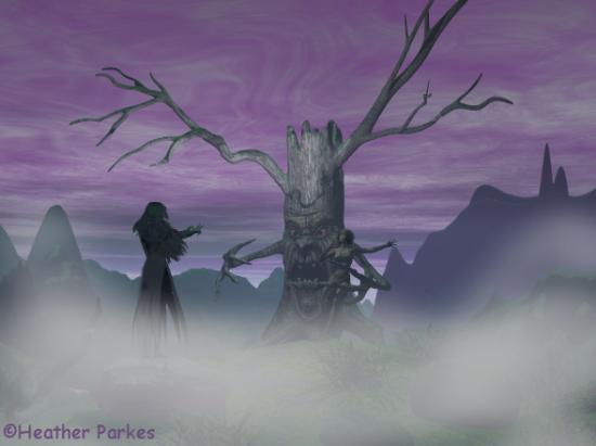
|
chaspo
(Stranger)
11/03/07 05:53 AM
|
|
Interesting composition. I like more light and contrast in my images, matter of choice.
I took your image, separated the layers and filtered each. I tried to work from back to front. Sky first till it looked right, then mountains, then tree and foreground, then hooded figure and lastly fog. With each element rendered seperately time and memory issues are reduced. I gain control over each element when it is rendered in layers.
|
Panthia
(Newbie)
11/03/07 11:39 AM
|
|
How the heck did you do that? I wanna know! PPPUUUUEEEEEZZZZZZ!
|
Lobsterhead
(Stranger)
11/05/07 02:13 AM

|
|
I agree with the above comment that the image could do with more contrast, also, mist usually appears thinner towards the viewer and thickens with distance.
|
Panthia
(Newbie)
11/05/07 01:04 PM
|
|
hahahaha the mist was done in PSP......
|
xantor
(Stranger)
11/28/07 11:23 PM
|
|
The tree figure is too centred in the picture, it would look better if it was a third of the way along the screen, centering the main figure tends to make the picture look a bit dull and static.
|
ekim_dl
(Stranger)
06/06/08 12:42 PM
|
|
Doesn't look that bad, but I would definitely be interested in some close ups of those 2 characters. Presently I am trying to collect some ideas for my own composition based on references from Female Anatomy For Artist ... inspiration is always welcome, you know ;-)
|
Zapboy
(Stranger)
07/20/08 08:54 PM
|
|
I would try at first a simple close up.
|


 [
[